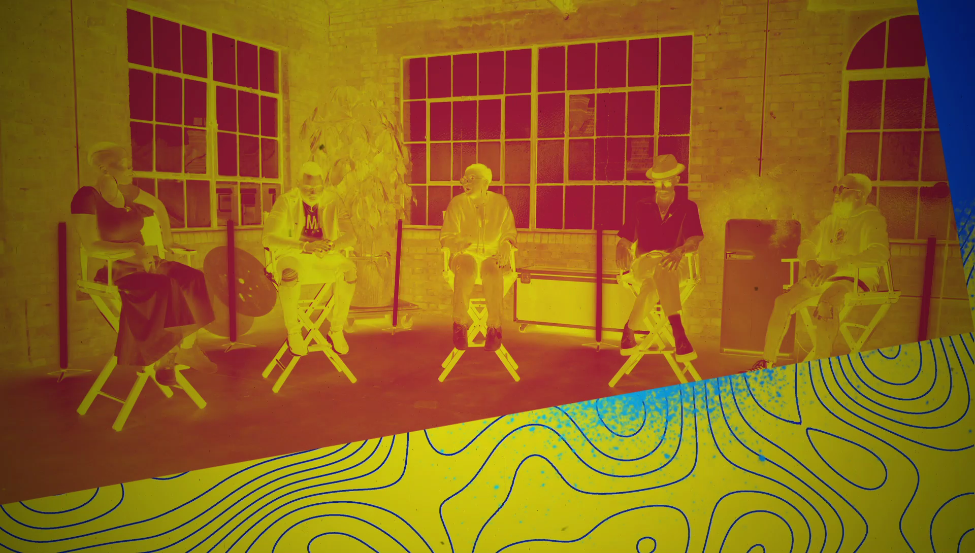
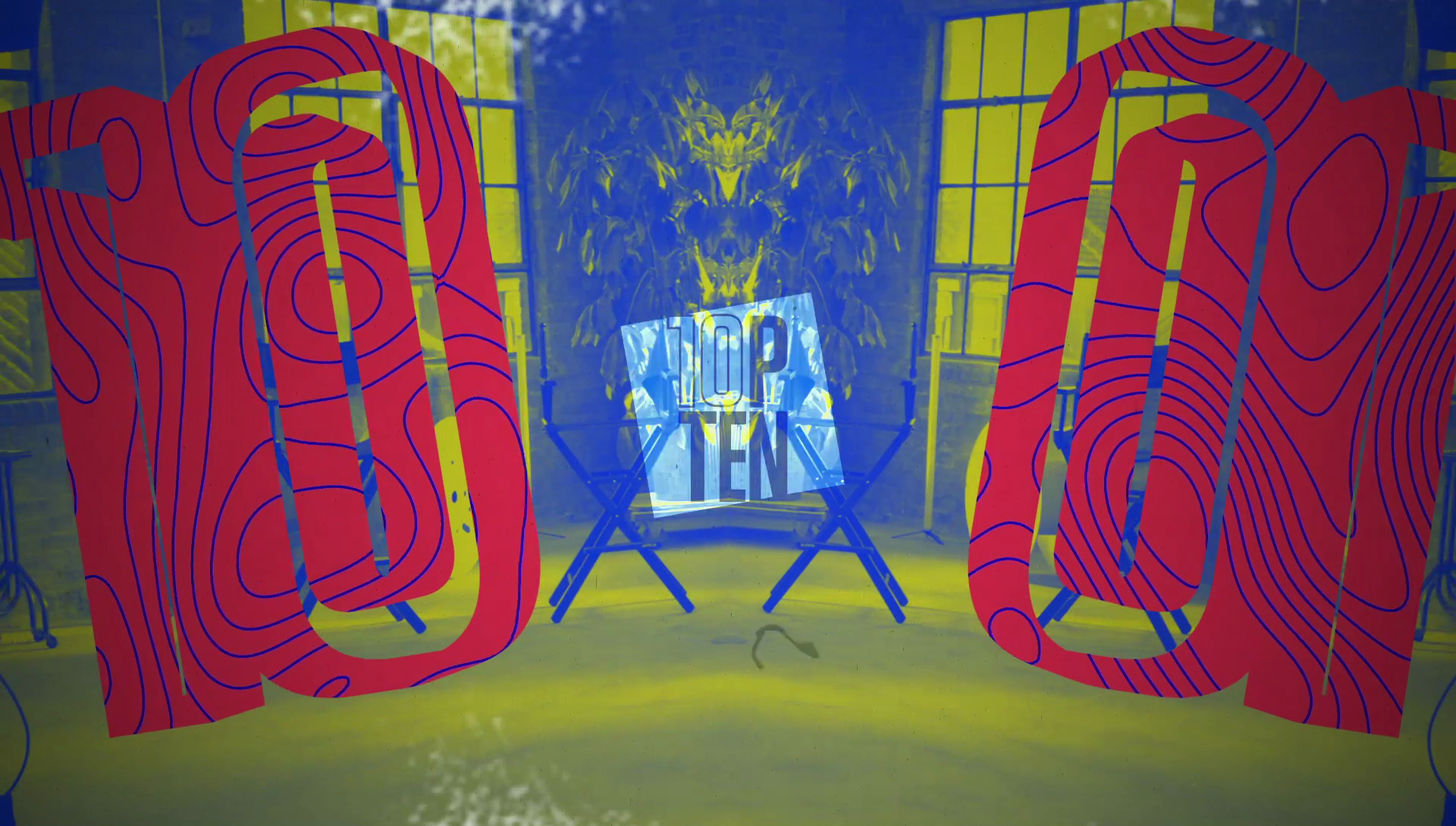
5 panelists go head to head, to create a final TOP TEN list with stringent criteria against the clock.
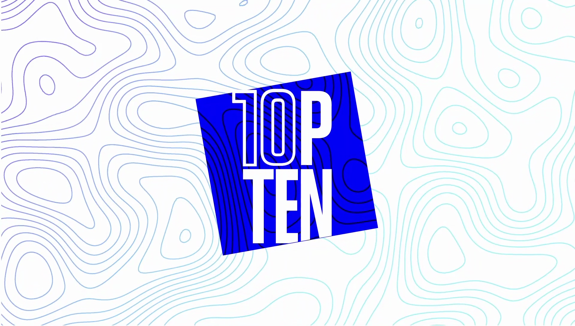
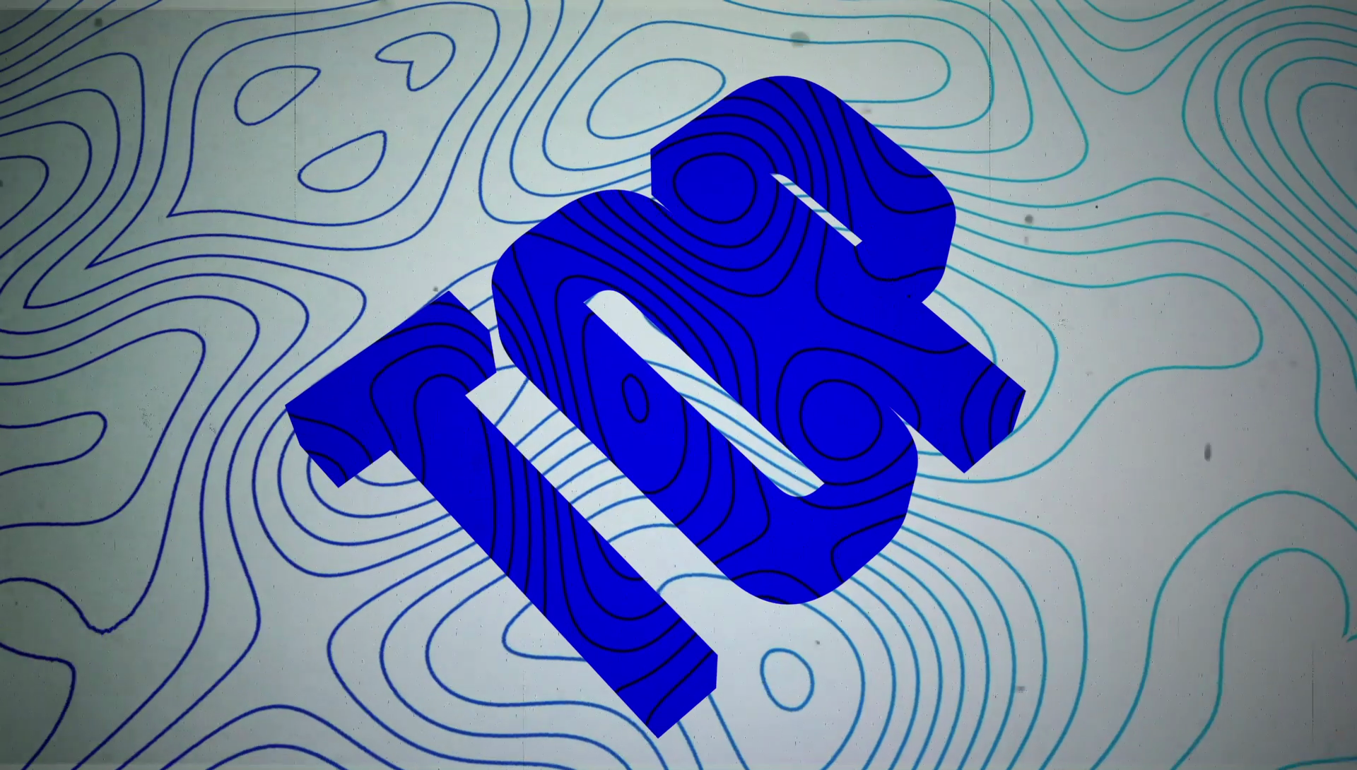
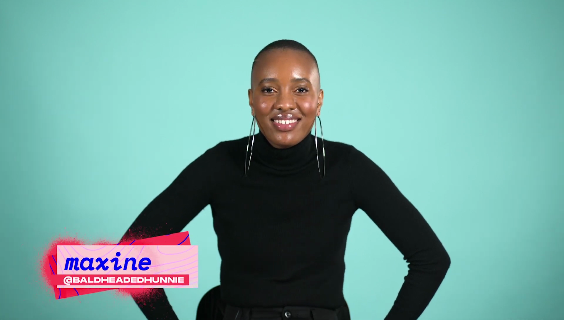
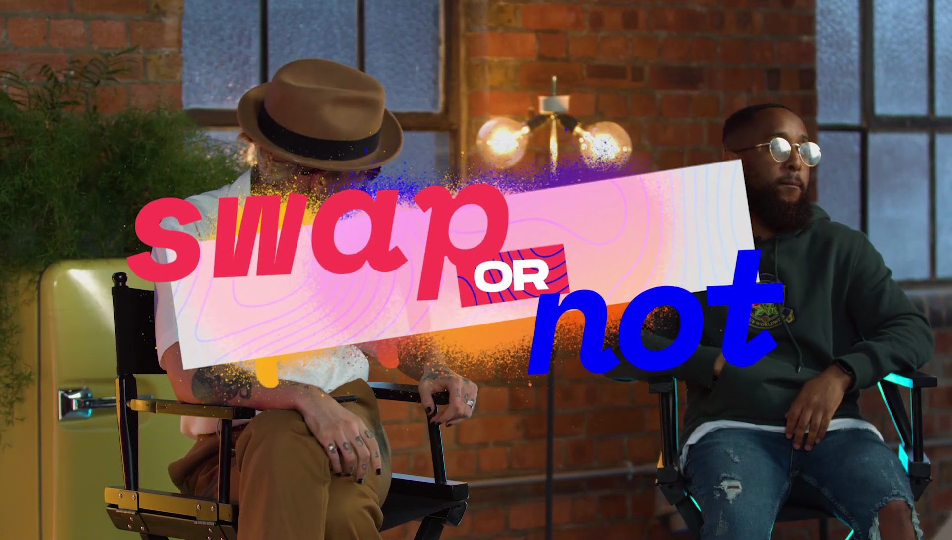
With a minimalist logo tilted 10 degrees representing the goal of balancing the instability from wildly differing opinions, bright colours to compliment the set, the colourful opinions of the show are represented in vibrant hues and topographical patterns for the show; with names set in lowercase to emphasise the informal feel of the show.
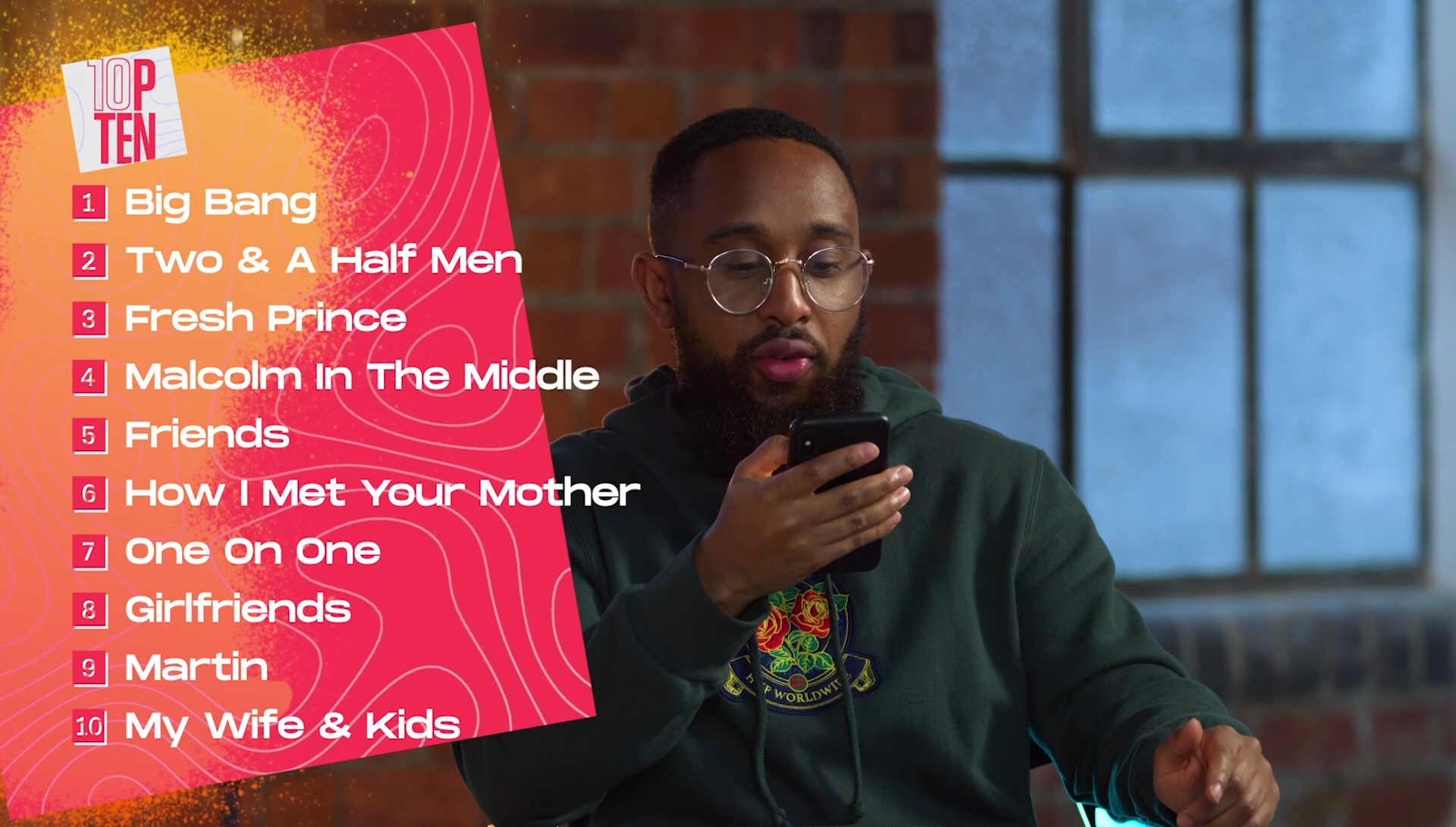
A whole package from title sequence to credits was created, including an easily editable list template for show editors to compile the final list of 10.